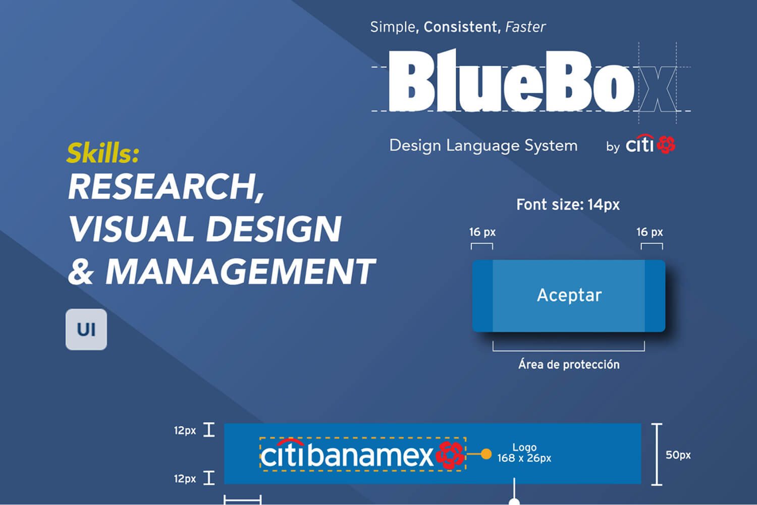
System foundation
Created the base of a design system planned to unify Citibanamex visual identity across channels, products, and teams.
Design system | 2019
A design language system created to unify Citibanamex visual identity across channels, teams, and digital product platforms.
Context
BlueBox was created as the design system for Citibanamex, giving digital product teams a shared foundation to create and ship interfaces faster, more consistently, and with clearer brand alignment.
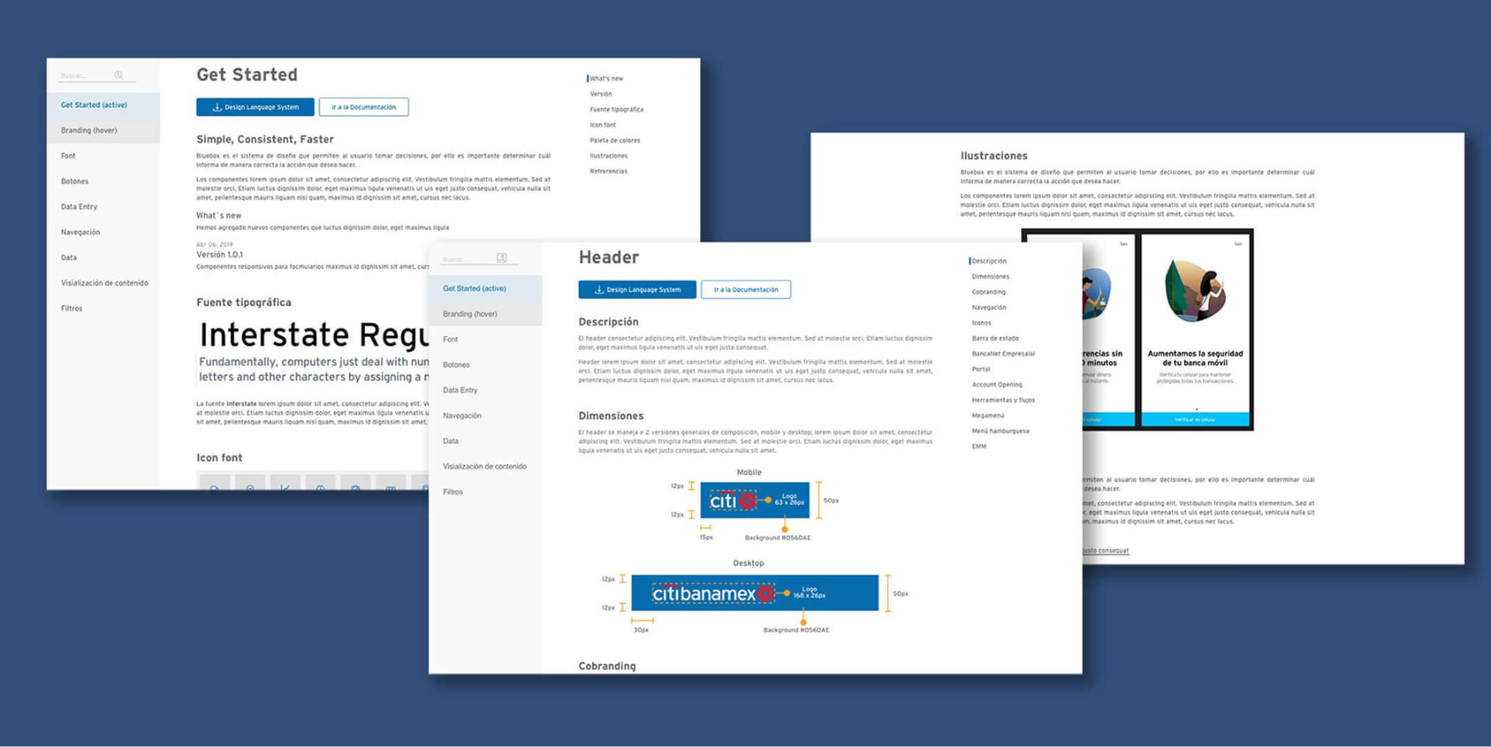
My work focused on building the system from its early stages: defining atomic components, designing the documentation website, validating use cases, and helping teams understand how to apply the system across web, app, marketing, email, and communication touchpoints.
Contribution
Created the base of a design system planned to unify Citibanamex visual identity across channels, products, and teams.
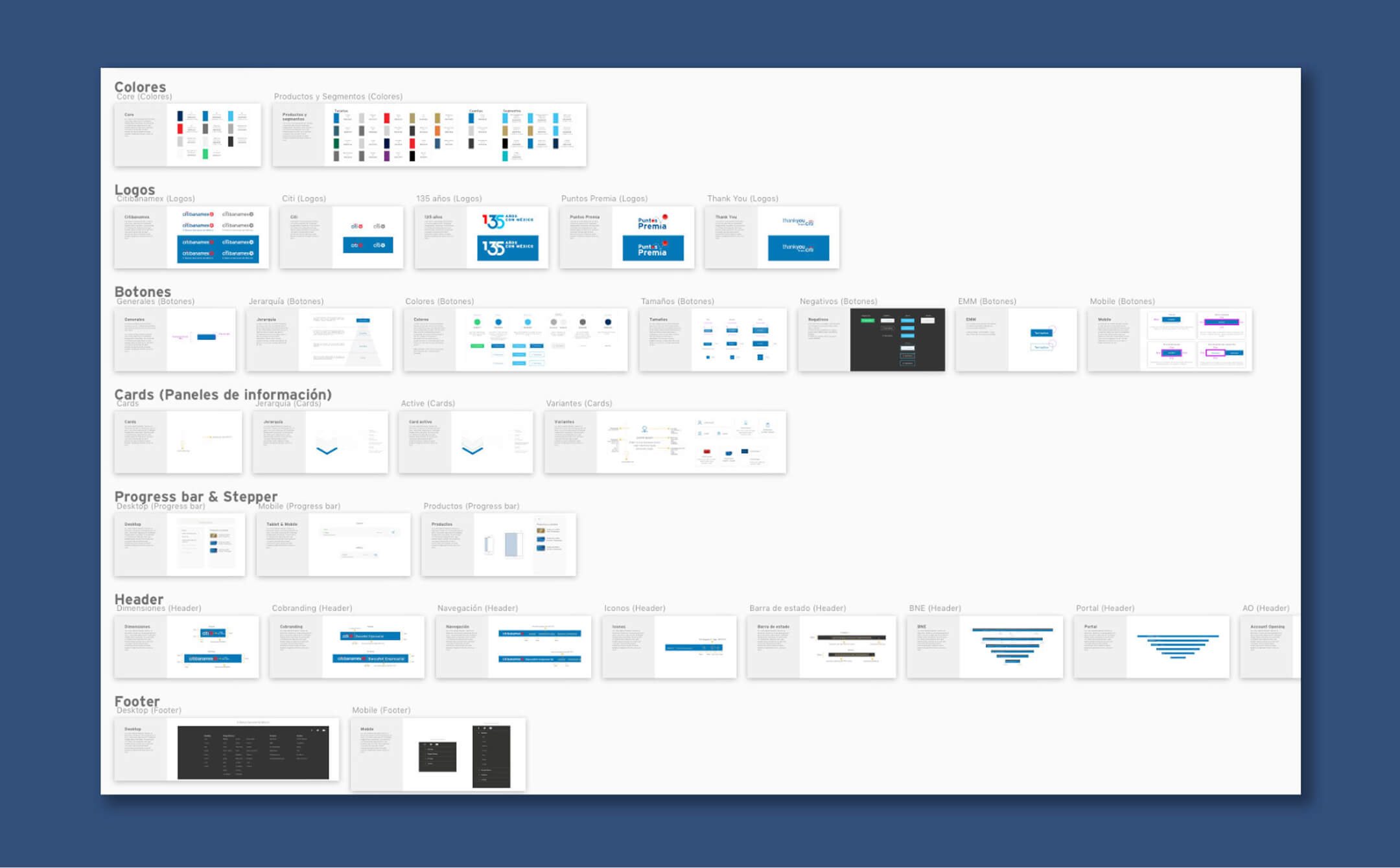
Validated component behavior against real product needs so patterns could work beyond isolated interface examples.
Designed the BlueBox website as a source of truth for designers, developers, and teams using brand and interface elements.
Coordinated app, web, marketing, email, and communication teams through joint sessions to define components and support adoption.
System evidence
Outcome
The work helped move repeated UI decisions into a shared system, making visual and interaction patterns easier to reuse across products and teams.
Beyond the interface artifacts, the project required alignment, guidance, and adoption support so BlueBox could behave as a living design system rather than a static brand document.